Feeds:
Posts
Comments

a little sketchy

DSCN0724 I’ve long wanted to learn how to watercolour, so signed up for Jane LaFazio’s class Sketching & Watercolor: Journal Style, which began last week. I’d like to think that with practice I could include passable illustrations in a nature journal. Today I finally took time to sit down with my supplies and have a go at lesson one. First up some colour blending; an opportunity to get familiar with using the waterbrush and practice the ratio of water to pigment used. Then on to the main lesson: fruit.

DSCN0726 Not quite sure why, but it didn’t occur to me that to watercolour successfully – or even adequately LOL – one would need to be able to sketch. I am certainly not accomplished when it comes to drawing, although couldn’t get into too much trouble with the simple shape of pears. Once happy enough with my drawing I committed to an ink outline on the paper and set out my paint. Sadly, I forgot to take a photo at this stage.

DSCN0733 
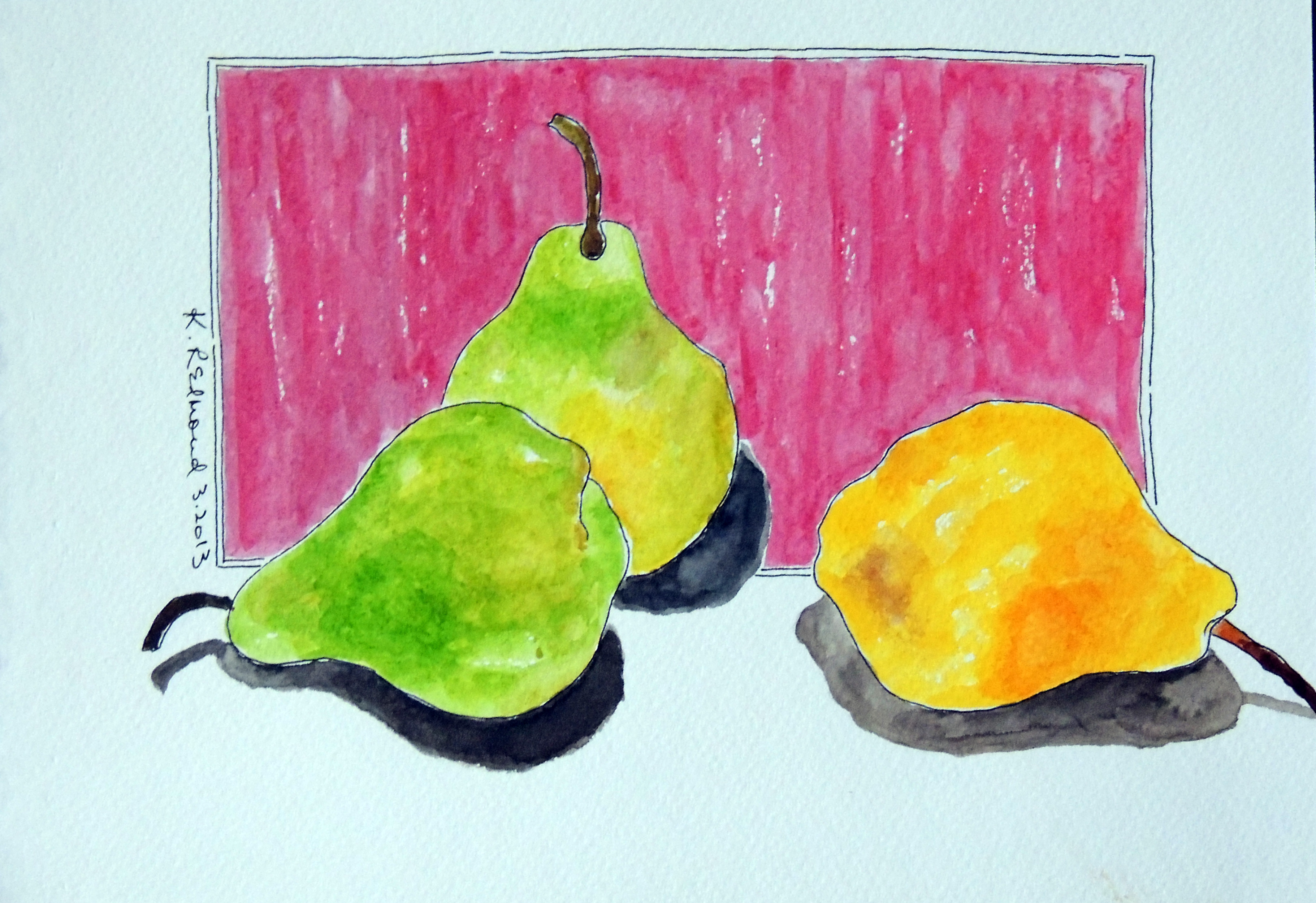
A couple hours later and I’m calling it done. I see a number of things I could definitely improve on – but I also some things I thought worked out well. Overall I’m pleased with it, my very first ever watercolour sketch.

What is it that you’d like to learn how to do?

Style Mix

DSCN0543 I’ve never been good at successfully describing my own scrapbooking style, although I’m sure I have one. While I long for a couple of catchy adjectives that sum it up in one quick phrase, the reality is more a series of design choices which combined together make a page definitively mine. A typical layout for me consists of two pages, multiple photos and a patterned-paper background. Usually clean and linear overall, but increasingly with artistic elements included.

Like many who spend time online, I read the blogs and admire the work of a number of well-known scrappers. Message board and podcast discussions cover everything from different scrapping styles to keeping your own work authentic. So I got to thinking, can you adopt someone else’s style and still create a page that is true to yourself? After finishing this page recently I think you can.

art class logo Wilna Furstenberg – and specifically her Art Class on Two Peas in a Bucket – was the inspiration here. It has become my goal this year to incorporate more mixed media techniques and products on my pages, and Wilna’s class provides an excellent primer for many of these techniques. In the album for my recent trip to Barbados many of my photos will simply be included in pocketed page protectors, but I thought I’d have a go at the class lessons using the trip photos that I wish to highlight, and will augment the album with these scrapped pages.

DSCN0540 A stencil and gesso were this lesson’s focus resulting in a very organic start to the page – making it quite different from my usual process. From there though, I can see that most of the choices are ones I’d normally make. The earthtone palette and Thickers title are typical, as is the variety of themed embellishments suggesting a visual triangle – despite attempting to put said embellishments in a vertical line as Wilna did.

DSCN0533 So although I began by intentionally setting aside my usual process, my final page does feel very much ‘me’. It will be interesting to see, as I work through the wealth of ideas artfully shared in class, if and how my current style evolves. But regardless of that outcome, I know I’ll have a good time getting messy and exploring the possibilities of my growing arsenal of mixed media products.

I would love to hear – do you have an identifiable scrapbook style, and how has it evolved?

DSCN0521While I love to take scrapping and mixed media classes in person, sometimes I’m not so good at finishing up right away the projects I bring home that aren’t complete. This is one such project, almost finished in a class with Dina Wakley last year but that I didn’t want to share until it was completely done and assembled.
Seeing a video promotion for Dina’s new book Art Journal Freedom where she demos the painting technique she taught in class had me pulling out my journal to get it done – and glad for the refresher after so many months.
DSCN0522While my painting technique doesn’t bear close scrutiny, I’m still quite pleased with the final result. Stencils, acrylic paints and Dina’s Artsy Painted Birds technique on a gesso’d surface comprise the cover of our tri-fold journals. Inside we tied two signatures that were inked with Dylusions spray ink, and stamped. The ribbons holding in the pages were also inked with Dylusions sprays; inking and scrunching those ribbons is the best inky-fingers technique I know!
DSCN0520I’m thinking I’ll use this little album to hold photos taken on some future hike with my naturalist group; any additional embellishing of the pages will be done when I add the photos. Have you painted any of Dina’s Artsy Birds? I’d love to see them!

The Art House Studio is a wonderfully inspiring mixed media shop owned by the very talented Karen Ellis. While not exactly local to me, it is close enough that I manage to get there several times a year.

In conjunction with moving her store to a new location in Cambridge Ontario, Karen invited her customers to submit an art house canvas to hang in the new store. The criteria were only that it be a 6×12 stretched canvas and have a house on it. Blame it on the German spun cotton mushrooms received in an ephemera pack or the mention of mushrooms in a podcast I listened to – or even an autumn walk in the woods, but the idea of creating a mushroom house was born.

I painted and texturized my canvas and sprayed ink through a stencil before adding my paper-pieced house. Rifling through a drawer of embellishments yielded some little grass and rock rub-ons so I added them, too. A piece of die-cut felt serves as a little fence in the foreground. Rather than paint the sides of my canvas I decided to add some strips of previously-painted deli paper from my stash. I really like the look of something added to the sides of a canvas in this way.

I envisioned my little mushroom house nestled deep in the forest, thus the addition of some some leaves stenciled with paint and die-cut grungeboard trees, embossed with distress embossing powders. I then stamped some vines in dark green archival ink before adhering my grass and flowers – and of course some of those spun cotton mushrooms. Enamel accents provided both the white spots for the roof and the door’s black knob. Sometime during this creative process it occurred to me that one might very well find a fairy residing in a house such as this, but as there are no woodland fairies here with me in the Glitter Grotto, I opted to leave my mushroom house unoccupied at present.

My canvas is even now winging its way to Karen’s shop via the postal service, hopefully to arrive in time for her Grand Opening on November 10th. Perhaps by the next time I visit a suitable fairy tenant will have moved in.

Box Magic

About time I shared this project, which was a gift for a Wizard of Oz fan in the family. (Remember, you can always click on the photos to view them larger.) I have to tell you, I hated the movie as a kid. It once gave me a nightmare of my bed whirling around in space, with me trapped in it. (Although now I might think that was kind of cool, but the dislike for the movie is firmly entrenched in my psyche.) Any time it would come on TV I’d be off to another room so as not to have to watch. I’ve probably seen most of it now – hard to avoid since the advent of videos – but I doubt I’d ever choose to sit down and watch the whole thing from start to finish.
But this classic is a favourite of G’s, and as such has supplied any number of gift ideas over the years. The first time I saw the Graphic 45 paper collection “Magic of Oz” I bought some with this in mind, although I didn’t decide how I’d use it until recently.
First up was to line the inside of a cigar box; a bit of scrapping’ serendipity in that one 12×12 sheet was exactly the right width to do this in one piece in the box I had. Because the interior would be otherwise plain (I wanted a practical box), the newspaper-style print was a good choice to preserve the fun imagery. The Wicked Witch of the West adorns the inside of the lid; a prominent position but out of sight when the box is closed.
Dorothy and her new friends take centre stage on top of the box; all sides and the bottom are covered in coordinating papers from the line. I added a metal spinner to the paper compass on the front panel giving it a bit of dimension. If you enlarge the photo you can see that Dorothy’s shoes have been Stickled to make them sparkle, and I’ve embedded G’s initial in Glossy Accents inside a TH ornate plate. I like to think that “G” could also stand for Glinda, G’s favourite character in the movie!
All of the box edges/where the papers meet are covered with TH Tissue Tape that I stained lightly to coordinate with the papers. Attaching the knob was a challenge because I wanted it facing forward and not screwed down into the top of the box, but I found just the right piece of metal to attach it with. From the knob I hung some metal charms; a TH Word stick “Know” for knowledge, a Heart, a Muse token “Courage” and as I didn’t have a house charm, a house key signifying Home. Unfortunately the papers I had didn’t feature Glinda, but I did make sure to position her right in front beside the knob when adhering the side strips to the box. The addition of a set of TH ornate box feet not only keep the charms from touching the table but add an elegant, finished look to the box.
Around the same time as I was making the box I came across a pop-out card that I thought would be a perfect project for the leftover papers. While it’s possible to buy templates for this style of card, given the fact that I hardly ever make cards I decided to study the card and figure out how to make it myself; at my normal hourly rate it would have been far cheaper to order the template, LOL. Never mind, I had the satisfaction of figuring it out – and I did save the cost of a store-bought card.
So here’s my finished box and card, which I think G was pleased to receive. While not a Wizard of Oz fan I nevertheless liked the box when it was done, and have plans to make myself one using some papers I can really get enthusiastic about. And bonus was the fact that I submitted this to the March manufacturer challenge over at Paper Secrets (using Graphic 45) and ended up being the monthly winner!

Following along with Tim Holtz’s 12 Tags of 2012, here’s my March tag. Seems kind of funny to talk about only 12 tags, because at the moment I’m immersed in Tim’s online class where we’re doing almost 30 tags in two weeks. But unlike class where our focus is on technique and indeed many of the tags are just background samples, the 12 Tags is a free monthly series of tags via Tim’s blog complete with background, focal point and embellishment.

The main technique in March is making a mosaic – and of course Tim puts his own spin on it. After adhering paper pieces to grungeboard I embossed my butterflies using Ranger’s Antiquities Weathered White embossing powder; I actually like better the way the white butterflies pop against the background as opposed to the more subtle effect of Tim’s sample using Cement embossing powder. The colourful mosaic bits are then covered with Glossy Accents creating a sort of stained glass effect, not visible in the photo but gorgeous in person. Combined with the organic nature of the Distress Stained ribbon and the overall shimmer provided by a hit of Perfect Pearls mist this is my favourite monthly tag so far!

ready to roll

I recently bought a new truck and decided to keep track of mileage expenses in style. I started with a 7gypsies wire bound album; there’s probably a blank book in my stash for any purpose you can think of. Easy to take apart, I masked the front cover and sprayed it with glimmer mist, then embellished it with a hand-coloured October Afternoon wild card, a piece of Studio Calico FabRips, mileage scale tape, a Basic Grey border sticker, handmade embellishment, hand-coloured fabric title and vellum quote which says “Don’t drive as if you owned the road. Drive as if you owned the car.”

While I wanted to keep the cover fairly low profile (I’ll be using it in the truck, after all) I couldn’t resist attaching this mileage wheel that I made by stamping into modeling clay, colouring and adding a metal spinner. The stamp is part of Tim Holtz’s Winter 2012 release; perfect for my purpose.


After deciding exactly what information I wanted to record I custom-designed the pages and ran them through my printer. On the first page I included details about my truck, and added a photo set in a frame embossed on the Cuttlebug. Aren’t my new wheels pretty?

The first section – almost half the pages – are for tracking things like fuel costs/average mileage, etc. I have additional sections where I’ll note scheduled maintenance and repairs, and also a section where I’ll record details of road trips such as destination and total trip mileage. After running them through the printer, I randomly stamped transportation-related images such as maps, compass rose, etc. on the pages. The map and gas pump image you see here are from the Route 66 set by Artistic Outpost. There’s a stamped header on the first of each section page – love those PSX Alphabet Pixies!

When I was gathering supplies for this project, I came across an ancient sheet of printed vellum with map images on it. Here you can see that I used it to further separate the sections of my book, and added hand-stamped tabs (this time old Autumn Leaves file tabs) to make it easy to find the right section. Can you believe I own a punch that makes those square holes? Don’t even ask!

The back cover was first masked and sprayed, and then stamped using various colours of Distress Ink. A rub-on repeating the words ‘my travels’ finishes it off.

So far, I’ve been good about recording mileage every time I refuel. While I can’t imagine that collecting this data will change anything about where or how I drive, I do think that it will be interesting to look back on in future; here’s hoping for the day when gasoline is obsolete and we can only reflect and marvel at having paid upwards of $1.30 per litre!

Thoughts on cute

With my grandkids off to Florida for March break next week, I thought I’d make money holders that I could put some spending money in for them. I’m not usually a card maker and certainly don’t do cute; where’s my Muse gone and who has replaced her?

Central to all is this crab stamp set now discontinued from SU – just the first of several old things dug out of my stash for this project. I don’t do the coloured-in thing, but did unearth a blender pen to help my novice efforts, stamped and cut out of glossy cardstock. A sun die cut, googly eyes and some Stickles, and the first one’s done.

Perhaps the tearing works on this next card because the technique is as old as the paper I used. So last decade, but can I just say how much the cartoon crab against the realistic-looking sand paper tickles my fancy?
I always love the imperfect look of hand-stamped sentiments; an opportunity to say exactly what you want, no matter how punny.
I’ll confess the idea to put a sparkler in the claw of this dude isn’t originally mine but it’s still darn cute – and fortunately I had the perfect fireworks stamp to pull it off. For all 3 cards I used my old Notch & Die cutting tool so the money tucked inside stays put; no need for envelopes.

Now I get why people do cute. I generally have fun at my craft table, but these guys had me actually giggling as I was making them, and I hope they’ll put a smile on the faces of my grandkids when they see them, too. Oh – one final word of advice when you make yours: keep your eye on your critters. When I assembled my cards I couldn’t find one of my crabs – he’d skittered all the way to the other side of my craft table. I haven’t a clue how he got there ;).

Sketchy business

It’s no secret to those who know me that I am an online class junkie; the Got Sketch 107 workshop is one I’m currently taking. I’ve long been a fan of Valerie Salmon’s sketches and in appreciation for all the free sketches she posts, occasionally support her by signing up for a class.
This sketch employs hexagons, a shape I recognized weeks ago as becoming a new trend in scrapping. Frequently I have an idea of what papers I’ll use before I start a layout, but in this case I went browsing in my paper files with an open mind and pulled out this coordinating line from My Mind’s Eye. Every time I use MME papers I am reminded again how much I love the look and texture of their designs. And lest I leave you with the impression I’m on the cutting edge of the trends, know that baker’s twine is just starting to show up in my layouts – despite having been on the market for a couple years now.
A discussion on the class forum about go-to colours had me deciding to break out of my usual routine for this next layout. So instead of greens & blues or anything with a nature motif, I went back to the paper carts looking for bright colours. You can’t get more majestic than purple, making this line from Fancy Pants an apt choice. As always I’m delighted to dig in my drawers of themed embellishments for a few suitable pieces, and like how the velvet Thickers in the title give a bit of softness – visible if you click on and enlarge the photo.
Working from sketches and using just patterned paper (no cardstock) are typical choices for me. The sketches for these layouts are private class content, but Valerie has many free sketches available at her blog if you care to check them out. And if you decide to sign up for a class, tell Valerie I sent you!

Nest at Ruthven

I joined a Bald Eagles and Snowy Owls tour yesterday, which we quickly renamed the Blowin’ in the Wind tour. Our first stop was Ruthven Park in Haldimand County, but with the feeders empty and the winds blowing we mostly birded by ear; the Eastern Bluebirds had arrived a day or so before and we could hear them hunkered down in their nesting boxes, as well as various woodland species I couldn’t spot. My only sightings were a cardinal swooping across the road and a gull over the Grand River, despite an hour tramping through woods and practically being swept away on the meadow.
En route to Fisherville and Nanicoke I saw some Buffleheads on the Grand and had an excellent sighting of a Red-tailed Hawk perched in a tree by the road, which we stopped to watch for a bit. We also watched some Horned Larks swooping in and out of a barn and hunting in a field; it’s amazing how even when you’re trained on one, as soon as they perch in the field they virtually disappear from sight. I obviously need better binocs!
With the lake (Erie) not frozen over the eagles are spread over a greater area; typically in winter they congregate at the open, warmer water by the Nanicoke Refinery. Given yesterday’s gale force winds we felt fortunate to spot 3 Bald Eagles battling the winds, which I understand is far fewer than usual. I swear the winds at that corner were 100 km/h, and although I was warm enough I couldn’t keep my eyes from constantly tearing. Back in the warmth and calm of the bus we headed towards Hamilton, stopping for a flock of Wild Turkeys who quickly retreated into the woods, and also a Northern Harrier that was a joy to watch.

American Widgeon

At LaSalle Park in Hamilton we finally found birds – waterfowl to be specific. Dozens of Mallards, a few American Black Ducks, some Buffleheads, Scaups, and American Coots. Lots of Herring Gulls; I didn’t take time to decide if there were others mixed in with the flock. And swans; at least 50 Trumpeters, a handful of Mutes and 8 Tundra Swans – the latter keeping their distance. One female American Widgeon and perhaps the best sighting of the day – a first year male King Eider.

King Eider - first winter male


Next we stopped at the Burlington Lift Bridge. No sign of the Peregrine Falcons although the nest is easily visible, but lots of Long-tailed Ducks in the freezing water.
Our final stop of the day was at Bronte Heritage Waterfront Park

Snowy Owl on the dock

where we found the Snowy Owl that’s been hanging around the docks, and several ducks including a Goldeneye. All in all given the weather, not a bad day of birding.